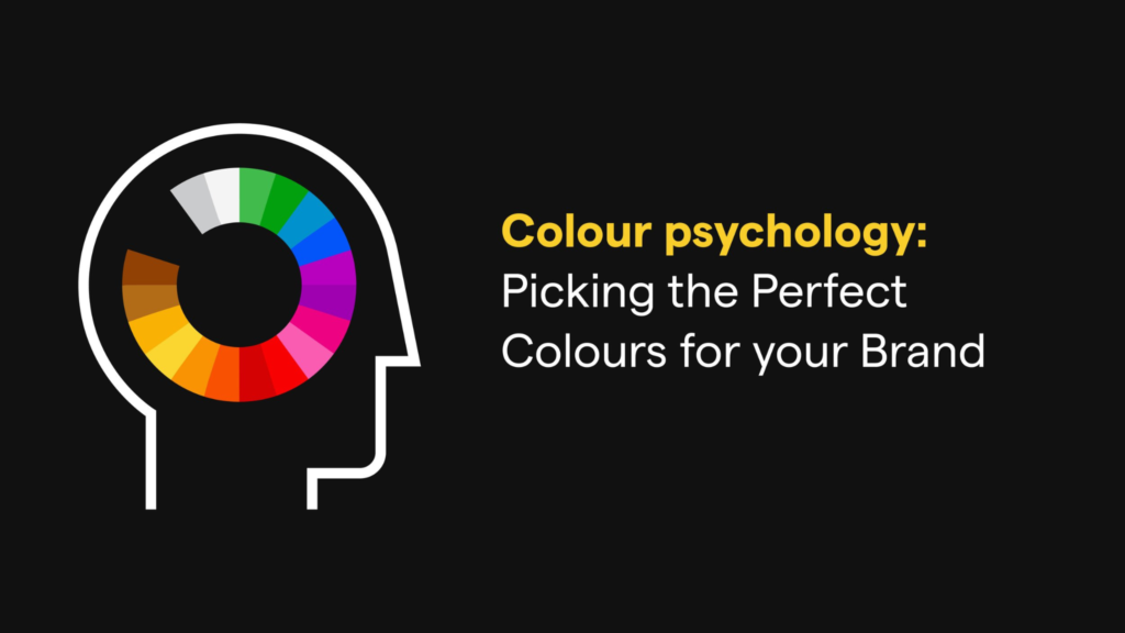
Colour Psychology in Marketing: Choosing the Right Palette for Your Brand
Colour is more than just a visual element—it’s a powerful tool that influences emotions, perceptions, and decision-making. In the world of marketing, the strategic use of colour can make or break a brand. Whether it’s Coca-Cola’s iconic red or Starbucks’ earthy green, colour choices are not arbitrary; they are carefully selected to resonate with the brand’s audience and convey specific messages.
In this blog, we’ll delve into the fascinating world of colour psychology, explore its impact on branding, and provide tips on how to choose the right palette to create a brand that connects with your audience.
The Science of Colour Psychology
Colour psychology is the study of how colours influence human behaviour and emotions. Research has shown that colours can evoke specific feelings and associations, often on a subconscious level. For example:
- Red can stimulate excitement and passion but can also signify danger or urgency.
- Blue is associated with trust, calmness, and reliability.
- Yellow evokes feelings of happiness and optimism but can also signify caution.
Understanding these associations allows marketers and designers to harness the emotional power of colours to create memorable and impactful branding.
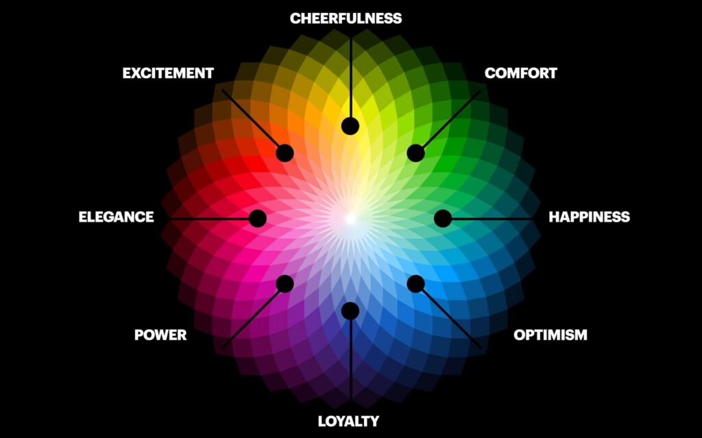
Image Source: google.com
Why Colour Matters in Branding
Colours are one of the first things people notice about a brand. According to studies, up to 90% of snap judgments about products can be based on colour alone, depending on the product type. Here’s why colour is so critical in branding:
1. Evoking Emotions
Colours can trigger emotional responses that align with your brand’s message. For instance, if your brand promotes relaxation and peace, blue and green hues might be your best choice.
2. Enhancing Recognition
A consistent colour palette helps reinforce brand identity. Think of brands like McDonald’s, whose yellow and red palette is instantly recognizable worldwide.
3. Influencing Consumer Behaviour
Colours can guide customer actions, such as making a purchase. For example, red is often used in sales signage to create urgency, while green is used to signify eco-friendly or organic products.
How to Choose the Right Palette for Your Brand
Image Source: google.com
Selecting a colour palette involves more than picking your favourite colours. Here are steps to ensure your palette aligns with your brand’s identity and resonates with your audience:
1. Understand Your Brand Personality
What does your brand stand for? Is it bold and energetic, or calm and nurturing? Use your brand’s core values to guide your colour choices. For example, a tech startup focusing on trust and innovation might lean towards blues and whites.
2. Know Your Target Audience
Colours can have different cultural and demographic associations. Research your audience to ensure your palette resonates with their preferences and expectations. For example, while white signifies purity in Western cultures, it’s associated with mourning in some Eastern cultures.
3. Focus on Emotional Connections
Think about the emotions you want your brand to evoke. If you’re creating a wellness brand, green and blue hues may help convey calmness and balance.
4. Use Color Harmony
Choose colours that work well together to create a cohesive look. Consider using tools like Adobe Color to explore complementary, analogous, or monochromatic colour schemes.
5. Test and Iterate
Before finalizing your palette, test it across different platforms (e.g., website, social media, packaging) to see how it performs and resonates with your audience.
Case Studies of Effective Colour Use

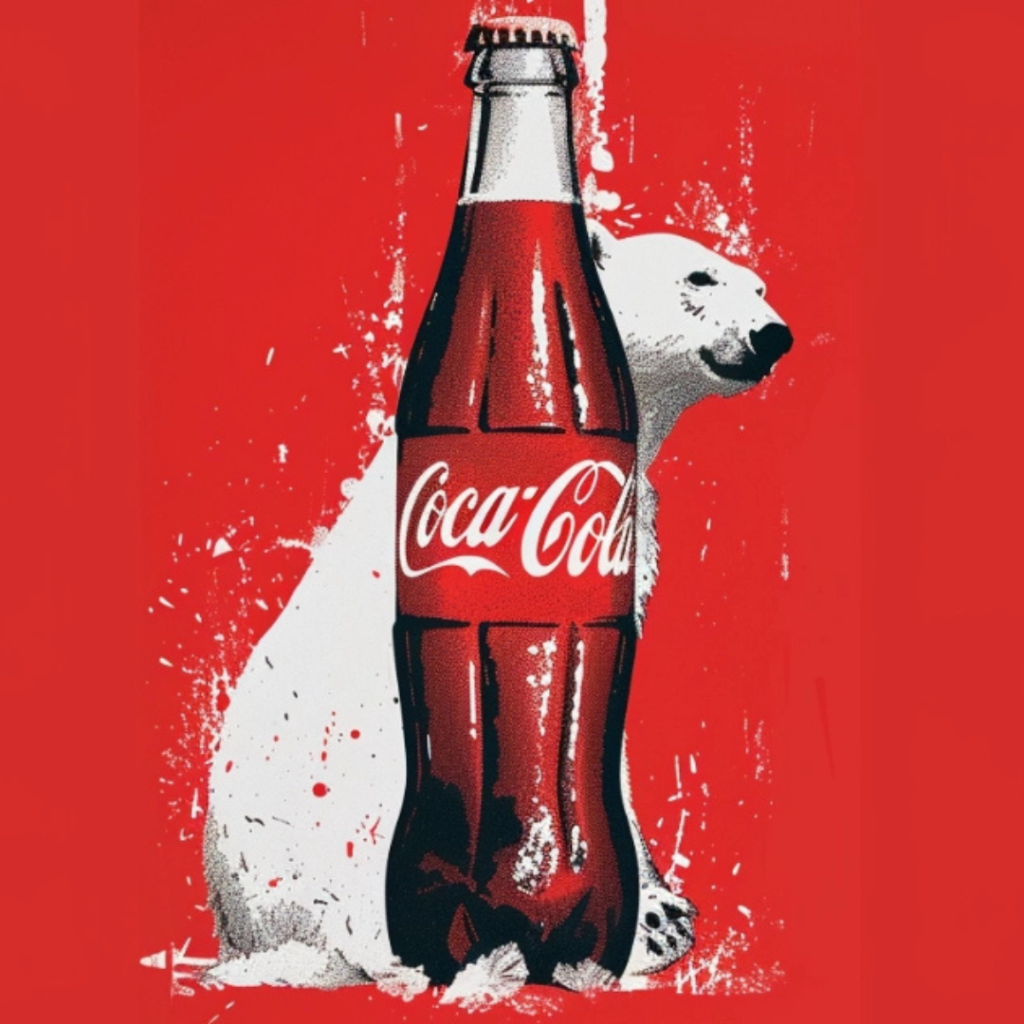

Image Source: google.com
1. Starbucks:
Starbucks’ green logo represents growth and sustainability, aligning perfectly with its eco-conscious brand identity. The colour evokes a sense of calm and harmony, reflecting the brand’s mission to create a relaxing coffee experience.
2. Coca-Cola:
The brand’s bold red exudes energy, passion, and excitement. It also triggers appetite, making it a perfect choice for a beverage company.
3. Apple:
Apple’s sleek use of white and black reflects simplicity, elegance, and innovation. The minimalist palette reinforces the brand’s modern and sophisticated image.
Avoiding Common Pitfalls
While colour can be a powerful branding tool, there are pitfalls to avoid:
- Overcomplicating Your Palette: Too many colours can confuse your audience. Stick to a primary palette with 2-3 main colours.
- Ignoring Cultural Contexts: Be aware of how colours are perceived in different regions and cultures.
- Sacrificing Functionality: Ensure your colours maintain readability and accessibility, especially on digital platforms.
Conclusion
Colour is a vital component of branding that extends beyond aesthetics to influence emotions, behaviours, and perceptions. By understanding colour psychology and making informed choices, you can create a colour palette that aligns with your brand’s identity and resonates with your audience.
Whether you’re launching a new brand or refreshing an existing one, your colour choices can set the tone for how your brand is perceived. So take the time to craft a palette that not only looks good but also tells your brand’s story.
To learn more about designing and branding through which you can stands out in the market, subscribe to our newsletter. Also follow us on social media for more amazing tips and tricks.
Author: Vivek Dara
Date: 27th Nov, 2024
Categories: Branding, Designing
Tags: Branding, Brand Strategy, Colour Psychology, Designing